Wednesday, March 22, 2017
Sunday, March 5, 2017
Interior Colors for Home Staging | Faster and More Profitable Home Sale | TOCON Pro Painters
TOCON Pro Painters
Calgary Interior Exterior High Quality Home Painting Contractor
Interior Colors for Home Staging
Faster, more profitable home sale

Changing paint colors is one of the easiest (and cheapest!) ways to update your entire home. The trick is to select paint colors that relate and flow from room to room.
Bold, bright or dark paint colors will likely turn many buyers away, because they will be thinking about all the repainting they will have to do. Most home buyers just want a "move-in-ready" home.
Limit your interior colors for home staging to earth tones and neutrals. Neutral wall tones create excellent backdrops for the color you are going to add later during the final staging, with furniture, draperies, artwork, and accessories. Added color will simply "pop" against a neutral canvas.
Balancing room color schemes
When using color in a room, use the 60-30-10 rule:- 60% of a room is usually a dominant color - This is typically the color on the walls.
- 30% of a room is secondary color - This may used in the furniture, drapes or a carpet.
- 10% should be an accent color - Accent colors can be the “pops” of color that brighten and add excitement to a room. Use color in accent pieces like pillows, accessories, artwork, throws, and flowers.


Apply complementary colors in unequal amounts by using the 80-20 rule:
- Complementary colors are two colors placed opposite each other on the color wheel
- The predominate shade should be 80% and the second color, 20%.
- If used in equal proportions, complementary colors will compete with each other, creating a jarring effect that may make some people feel anxious.
As a rule, you avoid using strong colors on the walls, floors and tile when you are neutralizing your home for sale.
Neutral colors

Neutral color palette
- Neutral interior colors for home staging include black and white, all the grays in between, beige, taupe, and earth tones.

- Neutral colors are the easiest to decorate with because they blend well with most surroundings and work successfully in all room designs.
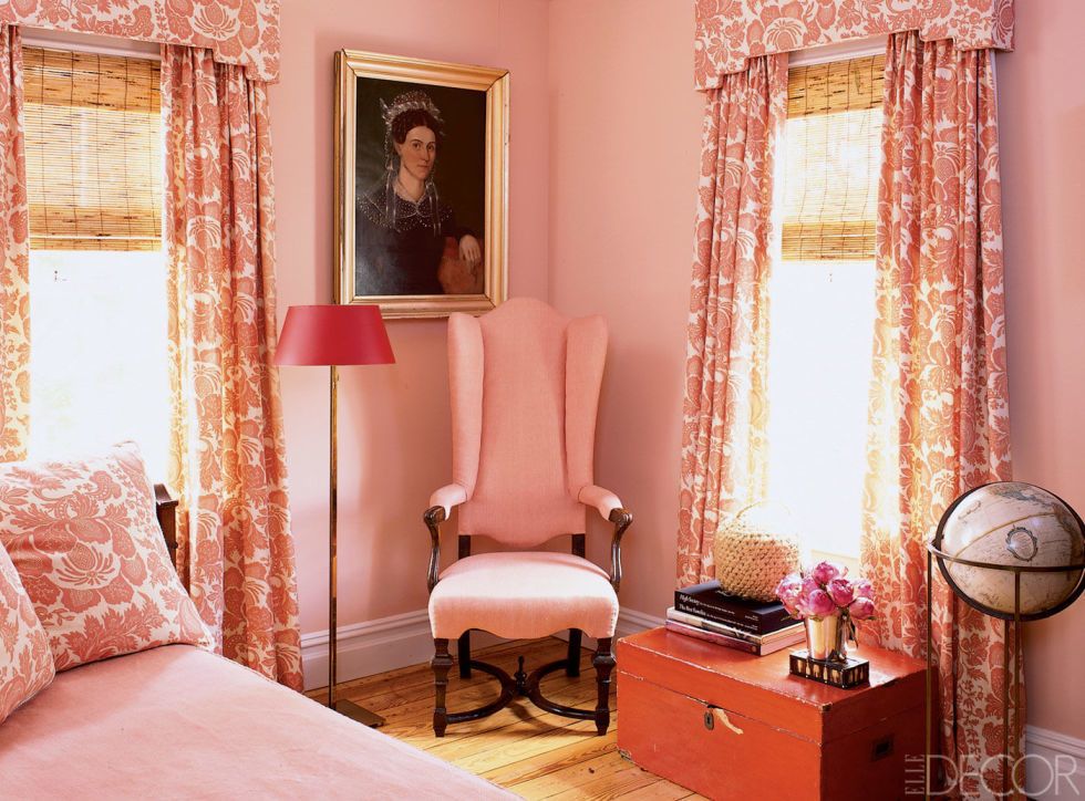
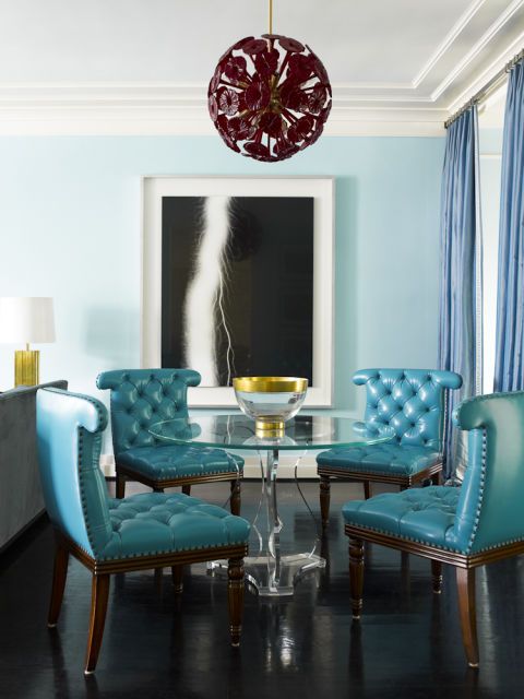
- Neutral color schemes don't have to be boring! Neutrals can be very stylish and sophisticated, as in the beautiful bedroom on the right.
- Art galleries always showcase artwork on a neutral background, because this allows the pieces to stand out better.
- Examples of interior colors for home staging that most people love; beige, taupe, ivory, coffee tones, honey, butter, golden, wheat, blue-green, mossy green, brown, blue-gray, and gray.
- Gray is a sophisticated color and very trendy at this time. Gray complements all other colors and serves as an excellent backdrop for brighter colors, allowing them to shine.
- Light neutrals and earth tones have the widest appeal among home buyers and will complement most people’s furniture.
Interior colors for home staging
Classic room designs begin with one main color and one or two accent colors. Start by finding one main color you like; perhaps drawing color cues from a favorite fabric, area rug or a piece of artwork.
You probably chose these items because you found the colors appealing, so why not use one or the other as a starting point? Just remember that one color should dominate while others serve as accents.
The easiest and cheapest way to prepare your home for sale is to paint all of your walls in the same neutral hue. Each room will look slightly different, because color changes under varying lighting conditions.
An easy way to create color flow is to use lighter and darker shades of the same color throughout your home.
A fan deck or paint color swatch from any home improvement store can help you select interior colors for home staging. The great thing about paint sample strips is that they take a lot of guess work out of choosing paint colors, as they contain one color in several different values.
Value: Varying degrees of light and dark-- the "brightness" of a color.
Select a monochromatic color scheme. Doing so will help with the flow from room to room.
Try to stick to a color palette of no more than 3 to 5 different colors in your entire home.
Remember to keep paint colors neutral; save the exciting colors for accessorizing.
and is of medium value.
- Antique Jade 465
- Guilford Green HC-116
- Timothy Straw 2149-40
- Jack Pine 692/Accent
The effect of lighting on paint colors
Color changes according to the type of lighting you have in a room. A color that you are happy with in natural light will look completely different under incandescent lighting.
You have to ask yourself; what kind of natural light does the room have? Are you going to be using the room mostly at night under artificial lighting or during the day? Is the room facing north or south?
Also consider the room that you will be adding color to, and view your paint samples under all lighting conditions, and at different times of the day.
Many paint companies offer small sample-size containers of paint that you can take home and paint on your walls before you commit to larger cans.
- Incandescent light will typically add a warm yellow cast to colors.
- Fluorescents will add a cooling gray cast.
- Halogen bulbs produce a very white light and have little effect on color tones.
- Colors that look vibrant in natural light will often wash out under incandescent lighting.
- Be wary of using dark colors in rooms facing north--they will appear darker. Warm paint colors will cheer up a room with a northern exposure.
- Paint colors will seem lighter and brighter under a southern exposure. Tone them down by painting in cool neutral colors.
Think
of each room in your house as a vertical space, mimicking nature;
Floors could be a darker value, wall colors a medium value, and the
ceiling in the lightest values.
If you follow this basic rule, you should succeed. Of course, this rule is not written in stone!
If you follow this basic rule, you should succeed. Of course, this rule is not written in stone!
Color flow from room to room
Interior colors for home staging should flow gracefully from one room to the next, especially if you can see adjoining rooms, as in open-concept living areas. You can achieve this by painting all your walls in the same paint colors, in coordinating colors, or in lighter and darker shades of the same hue.
To expand visually a space (or hide ugly moldings), use the same light color on walls, baseboards and trim work. Doing so will cause unattractive features to recede, or seemingly blend into the walls.
Another way to develop flow and create continuity is to have one recurring color from room to room. For instance, the color of a wall in the living room can be carried over into the dining room in the form of an area rug, upholstered dining chairs, a tablecloth, artwork, and so on.
Color undertones
How many times have you painted a wall and the color wasn’t what you expected? What appeared to be ivory in the paint can turned into a pale pink once up on the walls. How does that happen?
When you first look at a color you see what is called a "Masstone." This is the color we all recognize right away. Hidden within the masstone is the undertone, not always easily identified.
A color is created by mixing two or more colors together. The color that is used in greater proportion will determine the undertone of the color. For instance, if more green was used than any other color in the mixing, then green will be the undertone.
Hold a paint sample color against your furniture, kitchen countertops and cabinets, the flooring, different lighting conditions, green plants and so on. You will be amazed at the undertones that pop out.
Using color to create illusions
Color is the key to all successful decorating— it can work magic by visually expanding or shrinking space, raising and lowering ceilings and even effect our dispositions.You can trick the eye by using certain colors in the right places. Color can make objects visually advance or recede, and knowing where and how to use them can help you highlight focal points or camouflage ugly features of your home.

- For instance, a hideous brick fireplace will, most likely, be the focal point in your living room. Maybe you can't afford to tear it down at this time-- you just wish it would disappear. You can visually make that fireplace recede and diminish in size if you paint it the same color as the walls beside it.
- Proper color combinations can deceive the eye into thinking that a small room is larger than it really is, or take an awkward space and make it less noticeable.
- Pale colors reflect light, and when combined with lots of natural light can visually expand a small room by giving the impression of pushing back the walls.
- Dark colors absorb and deflect light and give the impression of the walls closing in on you.
- Cool colors appear to retreat, while warm colors seem to advance.
- Interior colors for home staging should have a combination of cool and warm colors in the design palette, but one or the other should dominate.

- Minimize the length of a long narrow room by painting the long walls a light color and the end walls in a darker warm shade of the same color. Because darker colors advance, this gives the effect of "squaring" the room.
- Paint a too high ceiling in a dark paint color and bring that color down a foot or so onto the wall-- you really won't notice the line on the wall. The dark color will make the ceiling appear closer.
- Paint colors that work well in small spaces are whites, neutrals, pale grays, blues, lavenders and greens.
- Visually lift a low ceiling by painting it white or a light pastel hue.
- To make a small room feel larger, paint the walls the same color as the drapes.
- If your room has ugly window trim or is broken up by numerous doorways, windows, and nooks, paint them the same color as the walls to unite all the broken areas.
- For over-sized rooms, use a combination of warm and darker colors. The dark colors will make the room seem cozier and more intimate.
What is the difference between monotone and monochromatic color schemes?
Both schemes use only one color and rely heavily on the use of textural elements and plants to keep them from being boring. Done properly, both designs will create a sophisticated and restful space that will make a small room appear larger than it actually is.
The monochromatic color scheme employs different tones, shades and tints of one color. For example, you will find a range of light and dark values of that one color in a room.
The monotone color scheme uses one color with very little variation in value, saturation and brightness. Done correctly, the monotone color scheme can be very calm and soothing.
Browse through interior decorating magazines or look online for ideas. Study room designs that appeal to you and try to determine what it is that makes them successful. Use a favorite picture as a starting point for selecting interior colors for home staging.
Paint your basement and hallways in light colors, since they are usually too dark.
Try
a coordinating color on an accent wall to add excitement to a room or
to draw attention to a lovely window, fireplace, or other architectural
detail.
If you have a lot of bumps and dings in your
ceilings and walls, use a flat paint. Because it doesn’t reflect light,
imperfections on walls and ceilings are less noticeable. Unfortunately,
flat paint is not very scrubbable.

Sherwin-Williams the Color of the Year | Calgary Home Painting Services | TOCON Pro Painters

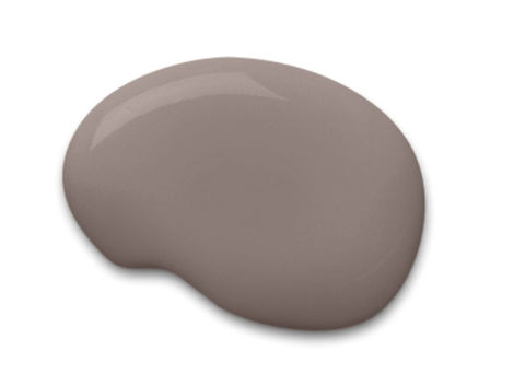
It's like gray and brown had a baby

You might recall that last year Sherwin-Williams chose "Alabaster" white
as the Color of the Year. Well, are you ready for their 2017 pick?
Drumroll, please: The big winner is "Poised Taupe," which isn't hot or
cold, dark or light, but something in the middle zone. Or, according to
what Sue Wadden, the director of color marketing for Sherwin-Williams,
told the Today Show: "It's like gray and brown had a baby."
The company says the hue
is a modern take on a timeliness classic and explained their choice in a
statement: "It signals a new direction in society's ever-growing thirst
for beautiful neutrals
that bring warm and cool tones together to create one irresistibly
versatile color." We have to say, this color definitely strikes the
balance between bold and subtle.
"Neutrals
are shifting," Wadden says. "For five years everybody's talking about
gray ― well, they're warming up." So, basically, if you want to stay
ahead of the trends,
this color is calling your name. Even though it's not a bright red,
blue or other in-your-face hue, it'll make a statement as soon as guests
enter your home. If you can't picture what this would look like in your
home, allow us to help.
In an entry way
with wood floors and white trim it comes off as traditional and
inviting — but we recommend adding a few colorful accents (like the
orange flowers seen here!) to keep the space from feeling stuffy or
boring.
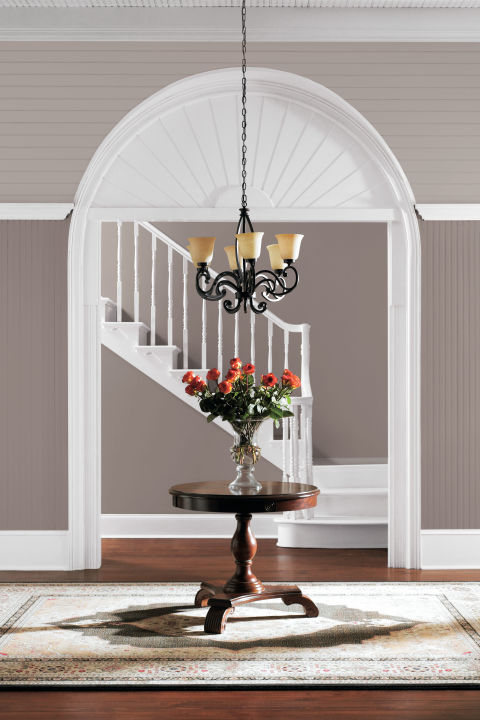
Sherwin Williams
Meanwhile, if you want to use it in your bedroom, try to stick with light-colored floors and bedding so the hue doesn't transform your nighttime escape into a dark cave.

Sherwin Williams
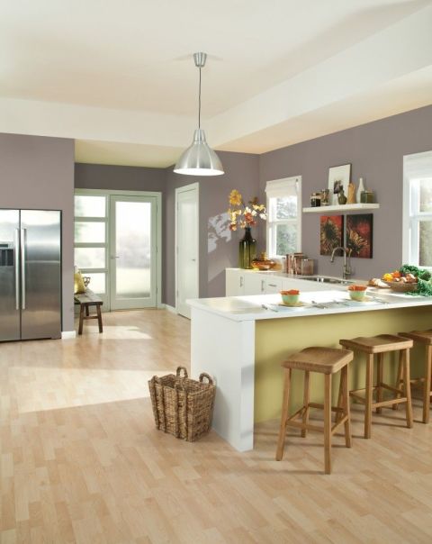
And in the kitchen, this dark neutral will pair well with most existing color schemes
(so you won't have to invest in brand new dishes). Here, a rustic
yellow and sea-foam green hold their own against the gray walls.

Benjamin Moore | 2017 Color Of The Year | Calgary Home Painting Services | TOCON Pro Painters
TOCON Pro Painters
Calgary Interior Exterior Professional Painting Contractor
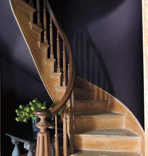
And it's anything but neutral.

Even
though in recent years whites, creams, and beiges
have ruled the design world, Benjamin Moore is taking a bold step away
from this safe choice. Sure, last year their color for 2016 was Simply
White OC-117, but this year they went with something they describe as a
rich, deep amethyst: Shadow.
"After
a year of looking at white, we were looking for something with more
feeling," a spokesperson for the company said at their reveal party at
the New York Public library this week. The company also shared a palette
of 22 colors they recommend pairing with this statement hue, which
includes other jewel tones like ruby and emerald.
Here,
the color is seen in a grand entryway and show homeowners you don't
have to go light and airy with your entrance. Sometimes a dramatic,
in-your-face hue does a better job setting a sophisticated tone to your
home.

Interior Home Paint Colors in 2017 | Calgary Home Painting Services | TOCON Pro Painters
Interior Home Designers Will be Drawing Inspiration from Your Personality in 2017
TOCON Pro Painters
Calgary Interior Exterior High Quality Painting Contractor
It's now 2017, which means one thing: It's time to discuss which home decor trends will define the year.
 On the color front, sophisticated hues are poised to take center stage, according to Behr,
which has predictions for colors to keep an eye on in 2017. The paint
company has divided its selections into three palettes — Confident,
Composed, and Comfortable — and if they are any indication, we'll be
drawing decor inspiration from our personalities in the year ahead.
On the color front, sophisticated hues are poised to take center stage, according to Behr,
which has predictions for colors to keep an eye on in 2017. The paint
company has divided its selections into three palettes — Confident,
Composed, and Comfortable — and if they are any indication, we'll be
drawing decor inspiration from our personalities in the year ahead.
Creative, social types will be drawn to the Confident palette, defined by dusky blues, spicy reds, and lime greens, designed to captivate your attention. Then there's the Composed palette. Its earthy greens and taupes will be a go-to for traditionalists looking to create a contemporary space. And it's all about pale pastels in the Comfortable range, characterized by light pinks, blues, and yellows that make the smallest of spaces pop. Its muted shades are ideal for introverts who want to make their first foray into accent colors.
We've already seen some of these shades make waves this year, so if you need some help imagining how they might play out in your own space, look no further than 9 rooms below. It's easy to see why we'll be obsessed with them well into 2017.

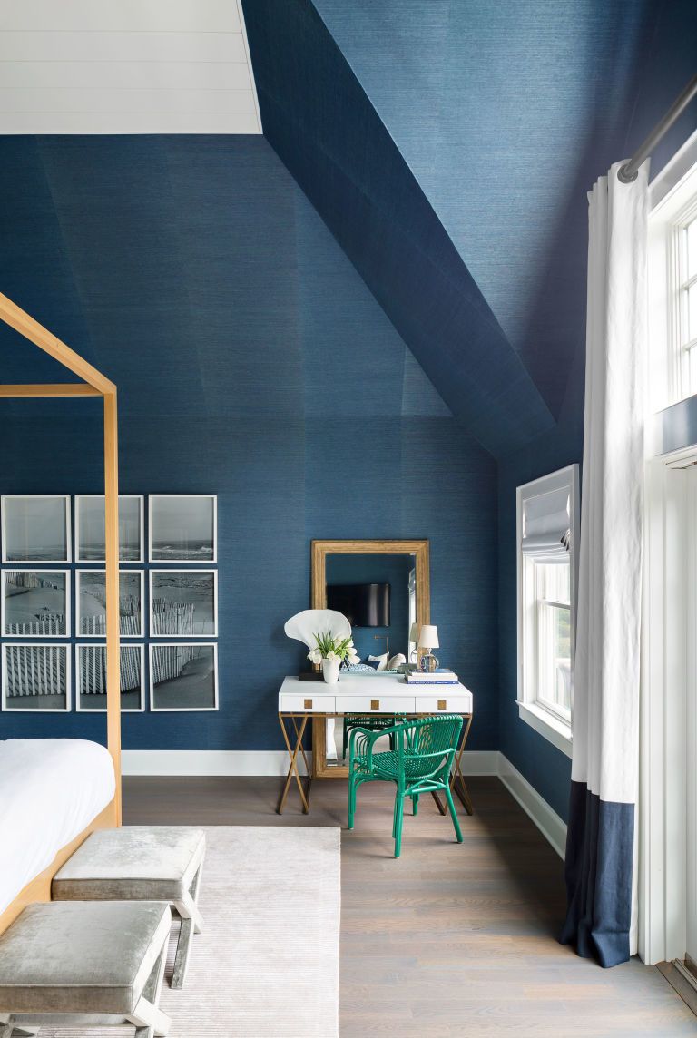
This Hamptons home
proves that feeling blue doesn't have to be a bad thing. Intended to
recall the colors of the ocean, the beachy shade used here highlights
the home's high ceilings.
Similar to shown: Endless Sea by Sherwin-Williams
 Orange accents pack a punch in a saturated green space. It's the perfect color combo for when you want to up the drama.
Similar to shown: Endless Sea by Sherwin-Williams
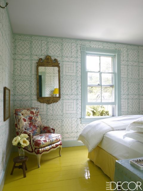
Yes, painting your floor lemon yellow is a risk – but don't you feel happier just looking at this room?
Similar to shown: Fiesta Yellow by Benjamin Moore
Similar to shown: Fiesta Yellow by Benjamin Moore
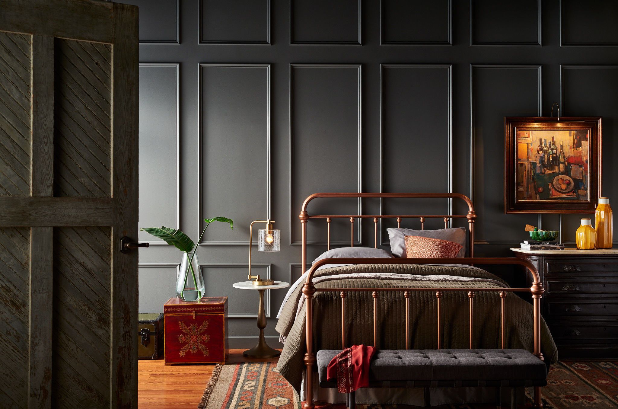
The best way to kick traditional
style up a notch? Paint your space a rich color like this dark gray. In
this case, the texture of the wall softens the solemn shade.
Get the look: Shades On by Beh
Get the look: Shades On by Beh
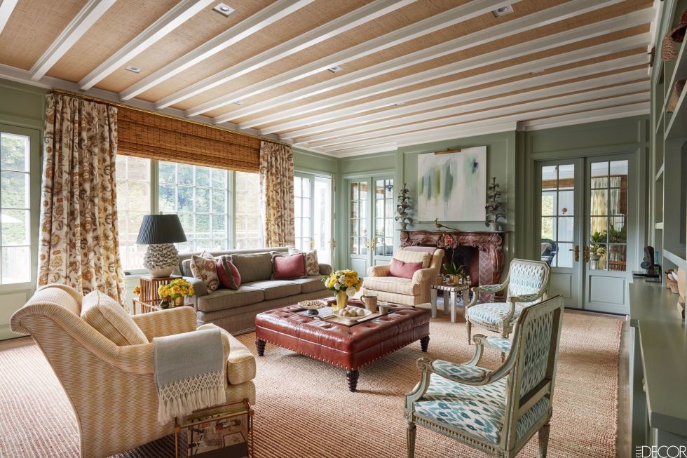
Taupe and earthy green create a calming vibe in an East Hampton summer home.
Similar to shown: Strong Neutral Tone by Farrow & Ball and Feathery Blue by Farrow & Ball
Similar to shown: Strong Neutral Tone by Farrow & Ball and Feathery Blue by Farrow & Ball
TOCON Pro Painters

Calgary High Quality Professional Painting Contractor
info@tocon.ca
www.tocon.ca
Saturday, March 4, 2017
Interior Exterior Paint Colors | Help to Sell Your Home | Calgary Home Painting Services | TOCON Pro Painters
Interior Exterior Paint Colors Helping to Sell Your Home

First impressions are everything when selling your home. A buyer may ask questions about house maintenance, the condition of your appliances or the quality of your neighborhood and schools, but these factors pale in comparison to the feeling a buyer gets the first time he or she steps into your home. If you want to sell your house in a short amount of time and with minimum hassle, it's critical that the decor is up-to-date and attractive.
You can think of your home's color palette as an important backdrop; it sets the stage for the furnishings and decorations that give rooms their unique feel. Picking the right paint is a topic that causes frustration for many. Paint is relatively simple to apply or change, but the wrong color inside or out can turn a buyer off from the entire house. To prevent this, many real estate professionals recommend painting your home in neutral colors.
If you're still living in the home you're selling, though, does that mean you're stuck inside a bland, beige nightmare? Not necessarily. Remember, the term "neutral colors" doesn't limit you to shades of white and beige. With a little pre-planning and a sense for the effect color has on the human mind, you can use browns, greens and even bolder colors to highlight your home.
And don't forget about the exterior of your home: Painting the exterior can also help attract potential buyers, but be careful.
WHITE HOME INTERIOR

You can't go wrong with white. In fact, a real estate survey
found that nearly 40 percent of buyers questioned liked a house with a
white exterior.
In picking a color, keep in mind the character of a neighborhood. If all the houses on the street are beige and tan, don't paint your house pink. Common sense, right? Not for many people. The color should also reflect the landscape. Consider the shrubs and trees when shopping for a color.
You can't go wrong with white. White is one of the safest, and most popular colors, to paint the exterior. According to one survey, nearly 40 percent of those questioned liked white. For one thing, white can make your house look larger. White also soaks up the light in a shady yard, and is also clean-looking. One of the nice things about white is that you can paint the trim with a color that makes the entire house pop. Remember too, white isn't just white; it comes in many hues.
Moreover, when choosing an exterior color, don't overlook the roof. A new roof is a major selling point. For one thing, no one wants to replace a roof -- a pricy proposition -- when they buy a house. A roof can also make a statement with color. While the most popular colors for a roof are blacks and grays, there are also reds, and greens and tans. If you're going to replace your roof prior to selling, an interesting color that complements the exterior could catch a would-be seller's eye in the right setting.
BEIGE EXTERIOR PAINTING COLOR
However, beige might not work on all types of homes. When picking an exterior color, remember to consider the type of house. Muted colors -- i.e. beige -- might not work on a Victorian home, where bolder hues would make the interesting architectural details pop
EARTH TONES/PAINTING COLORS
 Earth tones like oranges, browns and blues evoke a natural and inviting ambiance that is appealing to buyers.
Coffee, in all of its shades and textures, is a popular Earth tone that is a great match for stained hardwood floors, wicker furniture and rattan. Coffee is also a rugged color that can be accented with forest greens, muted reds and touches of white. And dark colors, such as espresso, are wonderful to warm up small rooms.
NEUTRAL PAINTING COLORS
Neutral colors, such as creams, also make a home look smashing in online photographs, which is the first place people check when searching for a house to buy. However, like everything else, there are exceptions to the rule. Unlike dining rooms or living rooms, bathrooms can be painted in more fun and whimsical colors. And, don't make the mistake of painting the entire interior of your house white. You might think that white is a neutral color. It's not. White is a bright, and bright is not always beautiful.
POPULAR PAINTING COLOR GREY

The right shade of gray combined with bright accessories can make a space look sophisticated and modern.
But this bold style isn't for everyone, and it can come across as imposing if a buyer isn't expecting it. The key to using gray effectively when selling your home is to pair the right shade with your home's overall feel. If you're selling a trendy urban loft, for example, you may be able to use a dark gray to enhance the effect of sleek, modern furnishings. The same color would look completely out of place in a traditional home with conservative furnishings. In that case, you could use a light gray to bring a feeling of coolness to a bedroom (since many grays border on shades of blue, their calming effects can be similar).
PAINTING COLORS ORANGE AND RED
If you'd like to grab a buyer's attention, then yellow is another great color for the kitchen, especially if there's a lot of sunlight streaming through the windows. Like red and orange, yellow reminds people of food. It also has a clean and airy summer like feeling. Yellow can be combined with red or green accents on chairs and small appliances, which also helps create a playful mood.
PAINTING COLOR BLUE

Light shades of blue can have a soothing effect and are perfect in a bedroom.
Blue, especially in its lighter shades, has a strong soothing effect on many people. It brings to mind images of clear, still days or the vast, meditative expanse of sky over the seashore. Blue walls in a room that gets a lot of natural light can take visitors back to a favorite beach or ski trip, and this pleasant experience can affect their impression of the entire room.
Dark blue can provide a regal, sophisticated feel when used as an accent wall color, but use caution when trying that effect in a home you're selling. A deep blue can turn off some visitors as being too dark and ominous. For the home sale, stick with lighter blues, and use them to tone down overly bright rooms with a soothing, cooling effect.
PAINTING COLOR YELLOW
Yellow evokes images of sunlight, summer and clear, bright days when paired with white trim. When used with darker accents, such as stained cabinetry, the color can radiate the warmth of a kitchen full of home-baked breads and cookies. Which mood you want to create depends on your home's design. Imagine the house as a stage: Would one of these colors fit better in the theatrical scene you would most like to create?
As with many bright colors, there is such a thing as too much yellow when preparing your home for sale. Stay away from glaring chromatic yellows, which may bring a sense of frantic intensity -- rather than happy warmth -- to your visitors' minds.
PAINTING COLOR BROWN

Dark furniture can bring extra warmth to a room with light brown walls.
Brown, in its lightest shades, can provide subtle warmth and fix the problem of glare that often comes with an all-white room. As shades darken into sandy hues, brown becomes an effective color to bring a rich glow to a room. At its darkest shades, brown can be a comforting, cozy accent that keeps a room from feeling too large.
Truly dark shades of brown should be saved for accents, such as a striking sofa or bookcase. Too much dark brown can give a room a cave-like feeling -- just think about the dreary, wood-paneled dens from the 1970s and '80s. Some homeowners like this effect, but for selling, you're much safer using a light brown as your main color and accents of darker hues to draw the eye into the space.
PAINTING COLOR GREEN
Much like yellow, green in its lighter shades can bring a cheery, country coziness to a room with white trim. Pairing a green accent wall and decor items with a room that's mostly white can create a playful atmosphere that's perfect for a children's room. In its deeper shades, green is an excellent complement to natural-finished cabinetry; the combinations of wood stain and green hues are nearly endless. If you choose the right colors, your cabinets will glow with radiant warmth that invites visitors into a kitchen or cozy sitting room.
Deep green can be extremely elegant, but it's best used sparingly in a house for sale. A dark green accent can add warmth to a tile backsplash, but too much deep green has the same dark, den-like effect as too much dark brown in a room. If a space could work with a darker green accent, consider a hue that has some blue in it: Blue-green shades can have a calming effect similar to shades of purer blue.
TOCON LTD
Calgary Residential Interior Exterior Home High Quality Painting Services
Professional Painters
info@tocon.ca
http://www.tocon.ca
www.facebook.com/toconltd
Friday, March 3, 2017
The Psychology of Color | Calgary Home Painting Services | TOCON Pro Painters
Room Color and How it Affects Your Mood
Color affects people in many ways, depending on age, gender, ethnic background and climate. Certain colors (or groups of colors) tend to get a similar reaction from most people; the variations come from the shades or tones used. This is why it’s so important to choose colors wisely when it comes to decorating.

Choosing color combinations is one of the most intimidating steps for beginners. Color has the power to change the shape and size of furnishings, as well as the shape and size of the room itself. Selecting colors is not difficult if you equip yourself with some basic information about color and its effects.
Let’s find out more about room colors and how they influence your mood.
Choose Wisely
Keep in mind that each color has a psychological value. Think about how certain colors make you feel; they can influence any emotion, from tranquility to rage. To create peace and harmony in your home, choose your colors wisely; some colors in large amounts might have the opposite effect on you and your loved ones.What mood do you want to create? Which colors will help you achieve that mood?
If you need help answering these questions, look at magazines, decorating books, blogs and websites for ideas. Also, let your textiles be your guide. Fabric, carpeting, furniture and tile are available in a more limited range of colors than paint, so choose them first and then decide on your paint color.
Once you find something you like, limit the number of colors in a room to no more than three or four. Too many colors can make a room look busy or cluttered. Paint is fairly inexpensive and transforms a room more quickly than anything else, so you can afford to experiment a little.
Room Colors and Their Effects
Colors act in three basic ways: active, passive and neutral. You can easily match every room’s colors to your personal desires, to your taste and to the room’s purpose. Light colors are expansive and airy, making rooms seem larger and brighter. Dark colors are sophisticated and warm; they give large rooms a more intimate appearance.Let’s take a closer look at colors and learn what they can do to a room.

Red has been shown to raise blood pressure and speed respiration and heart rate. It is usually considered too stimulating for bedrooms, but if you’re typically in the room only after dark, you’ll be seeing it mostly by lamplight, when the color will appear muted, rich and elegant.

Even though yellow although is a cheery color, it is not a good choice for main color schemes. Studies show that people are more likely to lose their temper in a yellow interior. Babies also seem to cry more in yellow rooms. In large amounts, this color tends to create feelings of frustration and anger. In chromotherapy, yellow is believed to stimulate the nerves and purify the body.

A pastel blue that looks pretty on the paint chip can come across as unpleasantly chilly on the walls and furnishings, however, especially in a room that receives little natural light. If you opt for a light blue as the primary color in a room, balance it with warm hues for the furnishings and fabrics.
To encourage relaxation in social areas such as family rooms, living rooms or large kitchens, consider warmer blues, such as periwinkle, or bright blues, such as cerulean or turquoise. Blue is known to have a calming effect when used as the main color of a room — but go for softer shades. Dark blue has the opposite effect, evoking feelings of sadness. Refrain from using darker blues in your main color scheme.

Green also has a calming effect when used as a main color for decorating. It is believed to relieve stress by helping people relax. It is also believed to help with fertility, making it a great choice for the bedroom.


Black is best used in small doses as an accent. Indeed, some experts maintain that every room needs a touch of black to ground the color scheme and give it depth. To make the job easier, rely on the interior designer’s most important color tool: the color wheel.

Color’s Effect on Ceilings
The ceiling represents one-sixth of the space in a room, but too often it gets nothing more than a coat of white paint. In fact, for decades, white was considered not only the safest but also the best choice for ceilings.As a general rule, ceilings that are lighter than the walls feel higher, while those that are darker feel lower. Lower need not mean claustrophobic: visually lowered ceilings can evoke cozy intimacy. As a general rule, dark walls make a room seem smaller, and light walls make a room seem larger.
These guidelines are a good starting point in your search for a paint color. Keep in mind that color choice is a very personal matter; you are the one who has to live with your new paint color, so choose a hue that suits you, your family and your lifestyle. If you have any tips to share, please leave a comment below!
Link: http://freshome.com/room-color-and-how-it-affects-your-mood/
TOCON Pro Painters
info@tocon.ca
http://www.tocon.ca
TOCON Calgary Pro Painting Contractor
Subscribe to:
Posts (Atom)